Ferheng.co
Overview
Individual
Figma
Turkish
An online dictionary service for Kurdish learners
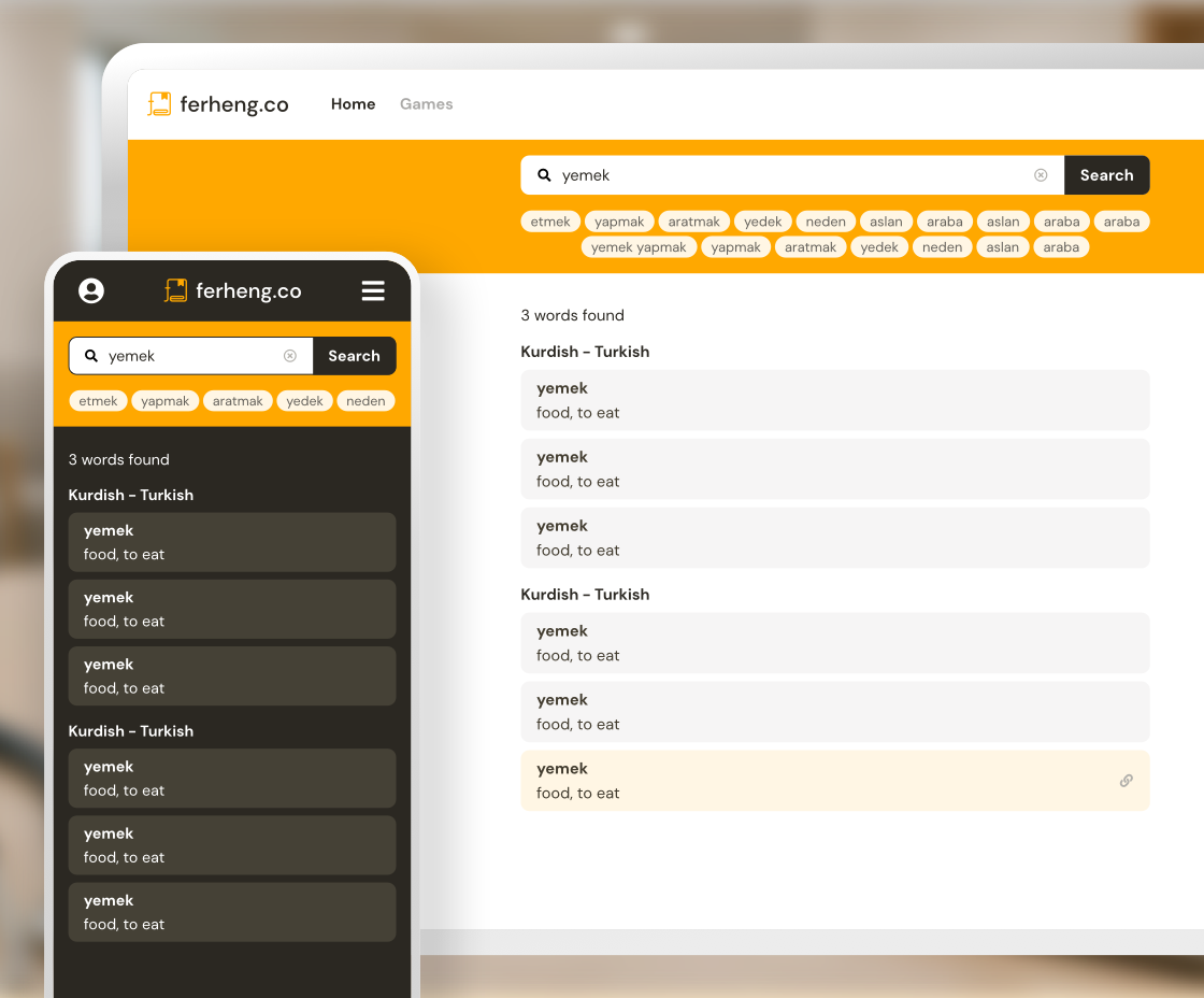
Background
Ferheng.co is an online dictionary service for Kurdish learners that has been operating for over 10 years. This time, he reached out to me for UI design and branding design during considering a comprehensive design revamp to align with feature improvements and the addition of new functionalities.
Process
1. Hearing
Initially, we held a thorough discussion to confirm the scope of the design revamp and the new functionalities we wanted to incorporate. To ensure we remained within the established budget, we carefully prioritized which aspects to focus on and what kind of design image we wanted to achieve, ensuring that there were no discrepancies in our understanding.
Specific request details
- Overall Design
- Define primary color
- Branding Design such as Logo Design (if time allows)
- Dark / Light mode
- Main Screen UI
- Create components
- Simple UI guideline
- Responsive Design
- Membership registration / login flows
2. Branding Design
First, to determine the overall design direction, I created a logo and selected the primary color. Since the main users are students and language learners, I set the design direction to be bright while avoiding a childish impression.established a design policy aimed at being bright without appearing childish.
Logo Design
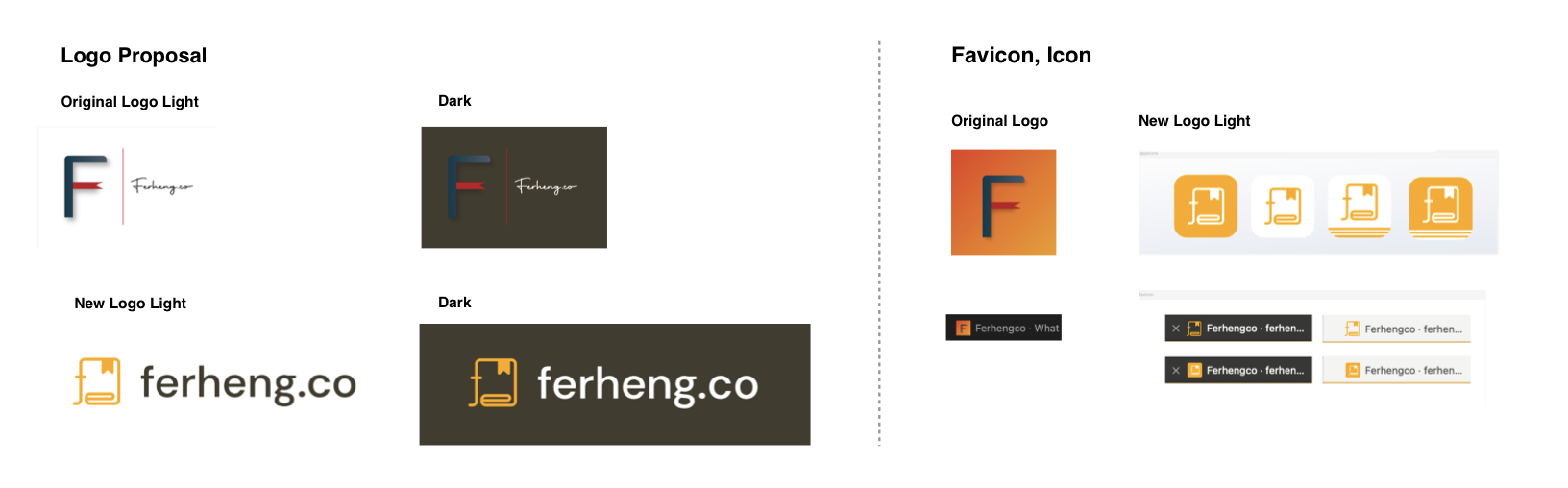
- Proposed a logo with 'fe' which comes from the service name and the shape of a book with bookmark which was a part of the previous logo
- Changed colors and shapes to ensure high visibility in both dark and light mode
- Adjusted the balance between the logo and typography to a more legible font and font size for the service name
- changed to a flat design without using shadows effects
Primary Color
We chose an orange shade that is in line with the previous primary color, which existing users are already familiar with.
3. Prototype & Trial Design
o align the design with the new logo and primary color scheme, I began directly with the main screen design. After creating a high-level wireframe, I developed the light-mode UI while simultaneously crafting the design system — including component creation, font selection, and typography sizing guidelines — to ensure visual consistency and brand alignment.
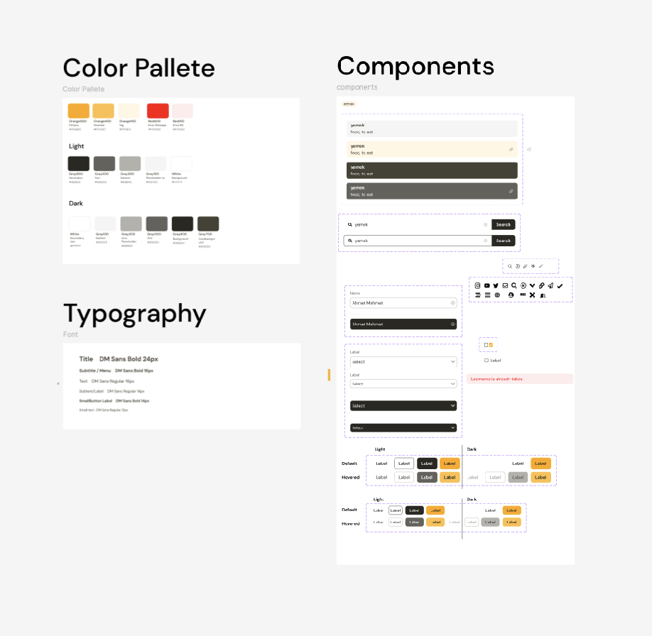
Once the main screen was complete, I conducted a review with the client to confirm their impression and make any necessary adjustments. After fine-tuning the details and reaching alignment on the overall design direction, I proceeded to design the remaining screens.
UI/UX Improvements for Main Screen
- Search bar is easily visible when the page opens
- Changed recent search terms on the home screen to a tag-like design for easy word separation and clear clickability
- Changed search results area to a compact and easy-to-read design