CRM for clinic
Overview
Beauty Product and Service Company
PO, Around 10 Engineers, 2~3 Designers
Figma, Confluence, Jira, Slack, Github
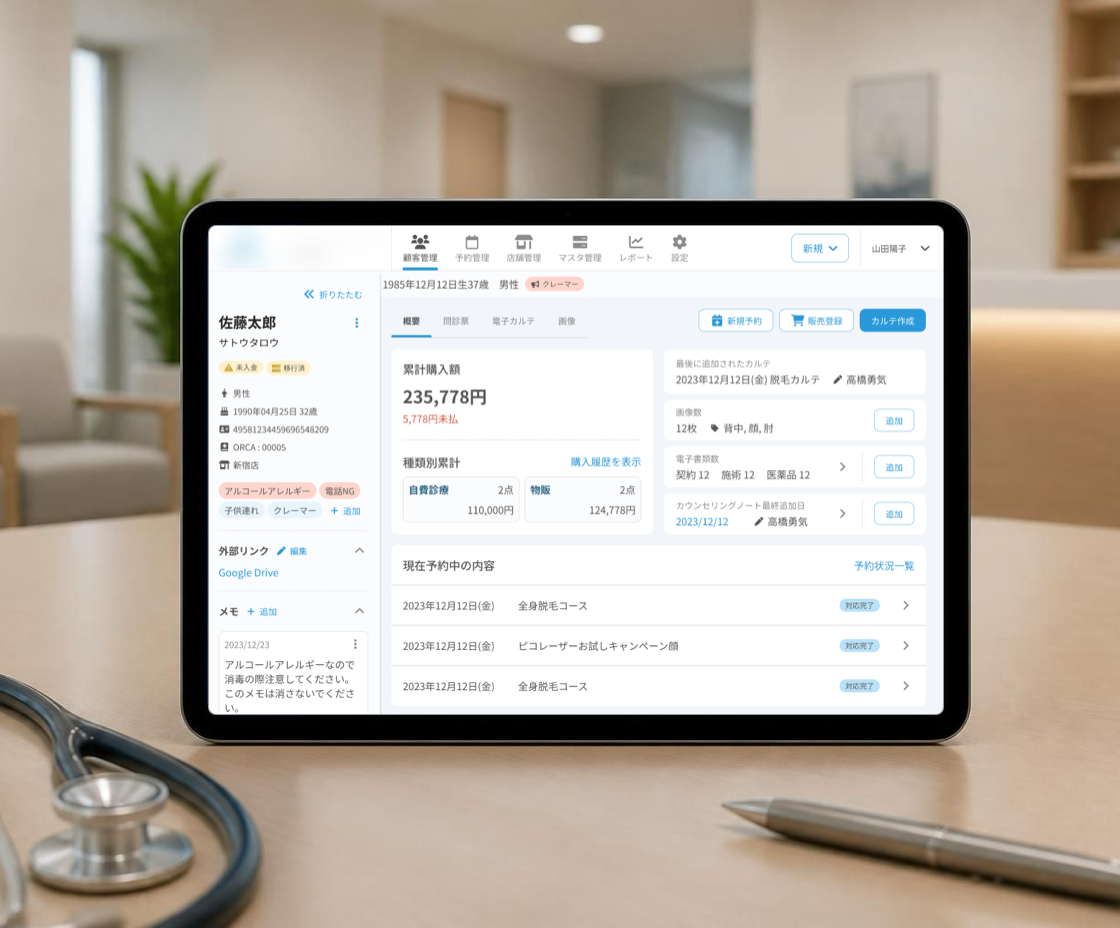
CRM to manage customer information, reservations, medical records for beauty clinics
UI Improvements
In this project, I was responsible for improving the user interface and adding new features. Below, I’ll introduce how I identified issues and implemented UI improvements, based on actual examples.
1. Hearing & Research
To gain a deeper understanding of the project, I first visualized the current system’s screen transitions and created a screen flow diagram to clarify the navigation structure. This helped me grasp the overall functionality, information hierarchy, and user flow.
Additionally, I had meetings primarily with the Product Owner (PO) to gather insights about user personas, their specific business tasks, and pain points with the existing system. Using this information, I developed a user story map and based on the map, I compiled the current screens related to each action and verified whether the business content matched the corresponding screens and assessed the overall usability.
2. Challenges & Solutions
Through the above activities, I identified that users often had to navigate across multiple screens to find customer-related information, as customer data was scattered across different pages categorized by type. I assumed this was a major cause of information omission and operational inconvenience during customer service.
Below are some examples of improvement proposals I proposed to address this issue.
Challenge 1: Important Information such as customer characteristics are hidden
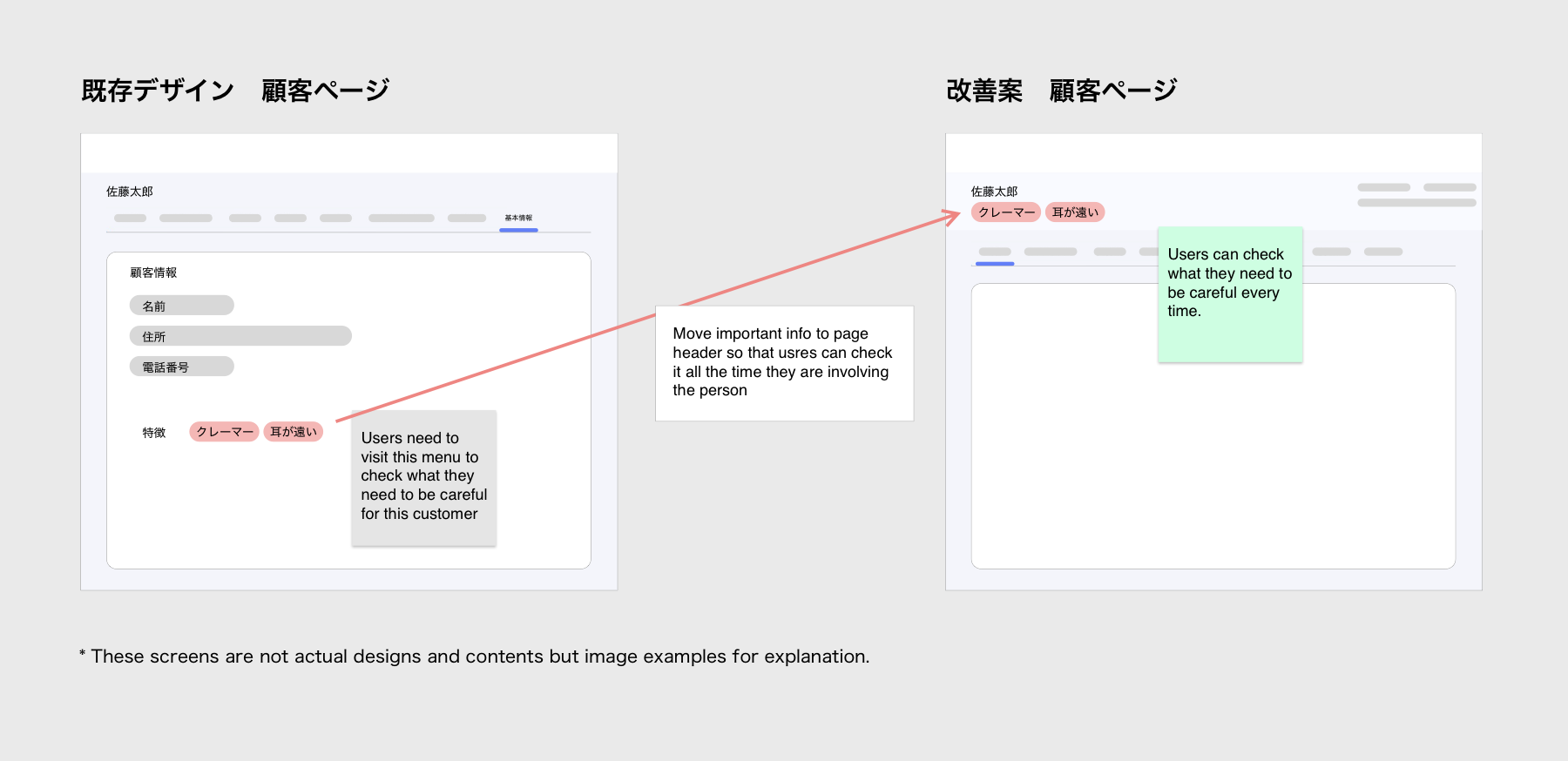
For example, there are screens for registering customer characteristics such as “complainer” or “hard to hear.” Although these details are critical for customer service, they could only be accessed by navigating to the customer’s basic information screen — making them difficult to reference quickly during service. To address this, I proposed adding a header section to the customer management screen, which would always display customer characteristics. By placing these details in a consistently visible location, users could immediately notice them upon opening a customer’s profile and would not overlook them while switching between related screens — ultimately improving service efficiency and reducing the chance of missing key details.
Challenge 2: Information can’t be referenced unless you search for it
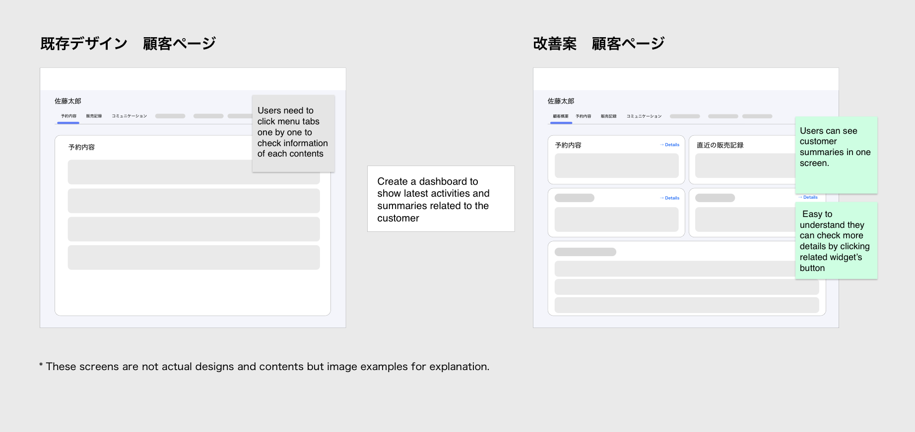
In clinics, users manage not only personal customer information but also reservation details, merchandise records, and other related data. However, there was no consolidated dashboard or summary screen that allowed users to view an overview of the customer or their activities at a glance — forcing them to navigate to different screens depending on what information they needed. In response to this pain point, as requested by the PO, I proposed introducing a customer activity dashboard — a single screen that consolidates all customer-related activities and history, enabling users to quickly reference relevant information without switching between multiple pages.