M&A Matching Platform
Overview
M&A Company
First half: PO, 3~4 Engineers, CDO, 1~2 Designers
Figma, Notion, Full Story, Confluence, Jira, Slack, Github
English, 日本語
Design and development of a matching tool and accompanying systems for M&A
Notes
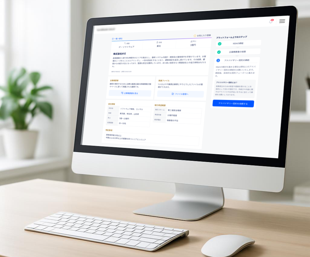
During the participation, there was a major organizational change, resulting in completely different team structures for the first and second halves. In the first half, I joined midway and was responsible for adding new features and improving existing ones to the current system, as well as designing new systems related to these changes. I worked in an international team consisting of a CTO, three engineers, a design lead, and designers, developing and designing in English using a fully Agile approach.
In the second half, I took charge of designing a new project based on the existing system from scratch. The team consisted of a product owner, two managers, one designer, and a development team. We adopted an Agile development approach starting from the point where the design had progressed to a certain extent.
Works
UI Design
In the first half of the development team, which included a design lead and 2–3 designers, we worked collaboratively to exchange ideas and feedback, ensuring our designs were visually clear and user-friendly. Below are some examples of screen designs we implemented.
Hierarchical Information Design
For the seller information display screen, we structured the content with clear hierarchies—such as basic company information, company introductions, and detailed corporate data—making it easier for users to navigate.
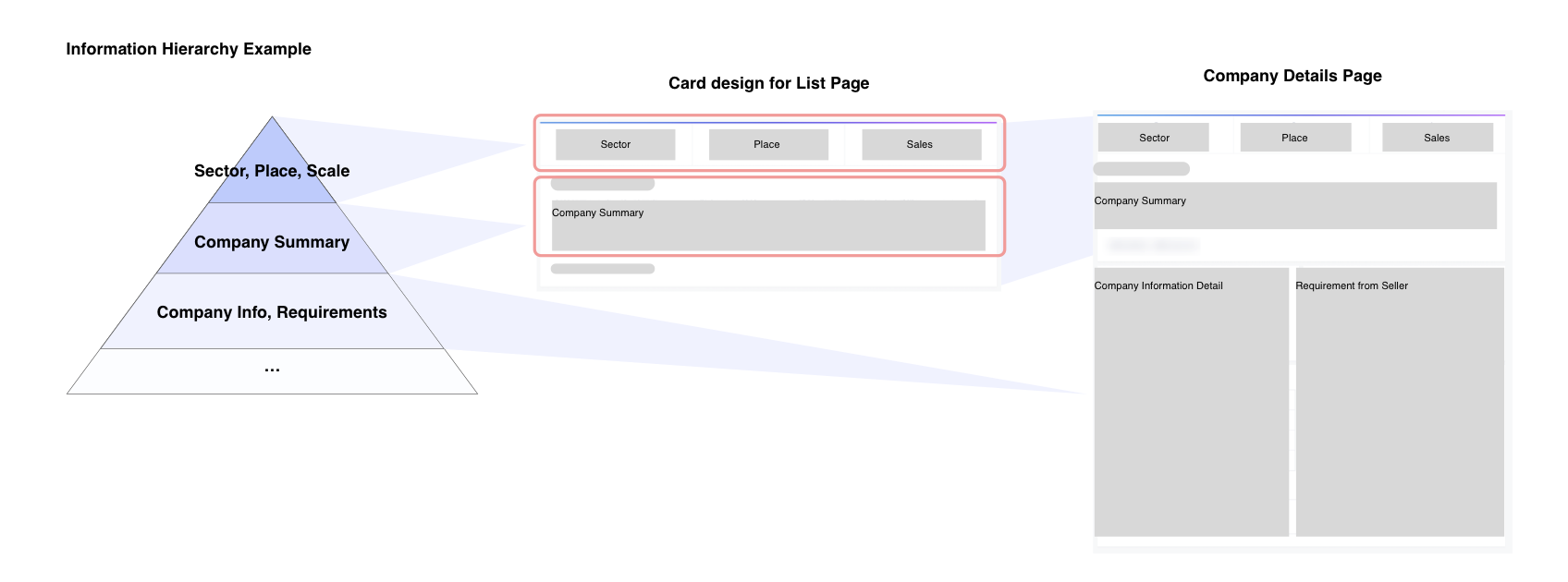
Additionally, we maintained the card design when transitioning to detailed views, ensuring a smooth flow of information.
User-Friendly Screen Design
To make it easier for users to find interesting companies from a long list of sellers, we focused on small design details.
For example, in UI improvement process, we also looked into user eye movements to create a more scannable list design.
In M&A, buyers use different strategies, such as searching for competitors, specific cross-industry players, or high-performance companies regardless of industry. To accommodate all these strategies, we designed a list that was easy to scan visually.
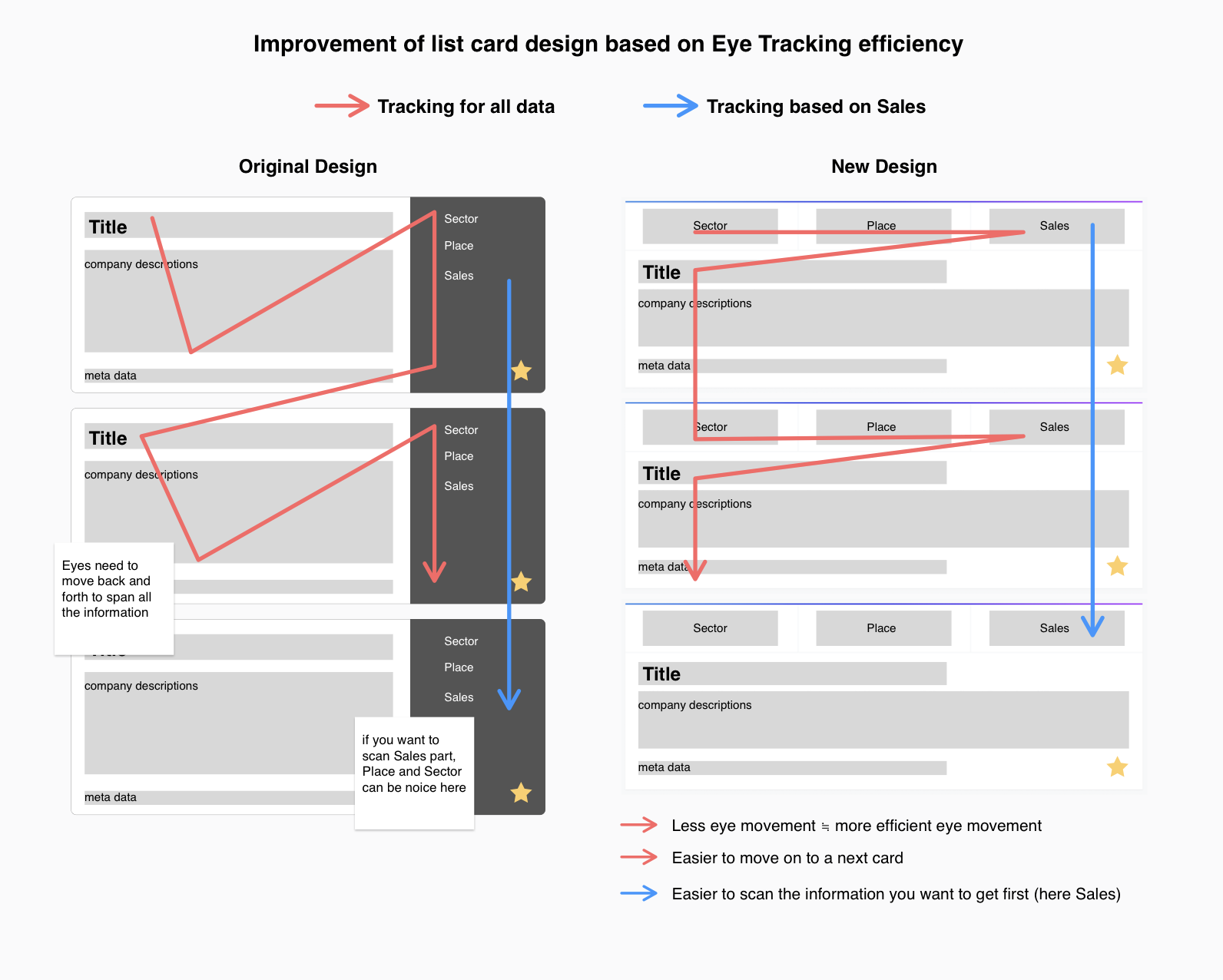
The previous design separated basic information with different colors and formats, which was convenient for users looking at overall company basic information but caused eye strain for those who needed not all of the information but only one or two of them. The new design ensures that users can follow the information naturally with minimal eye movement.